Brand Overhaul
Strengthening a crypto community's market presence
Kaizen, a cryptocurrency trading community founded by Brian Jung, empowers over 30,000 members with expert trade setups, market insights, and educational content. Despite its strong following, the brand struggled with inconsistent visual and verbal identity across platforms like Discord and its website, weakening its market presence. The challenge was to refresh Kaizen’s brand to unify its identity, solidify its leadership in crypto education, and create a centralized platform for educational resources, ensuring resonance with members and employees.
Overview
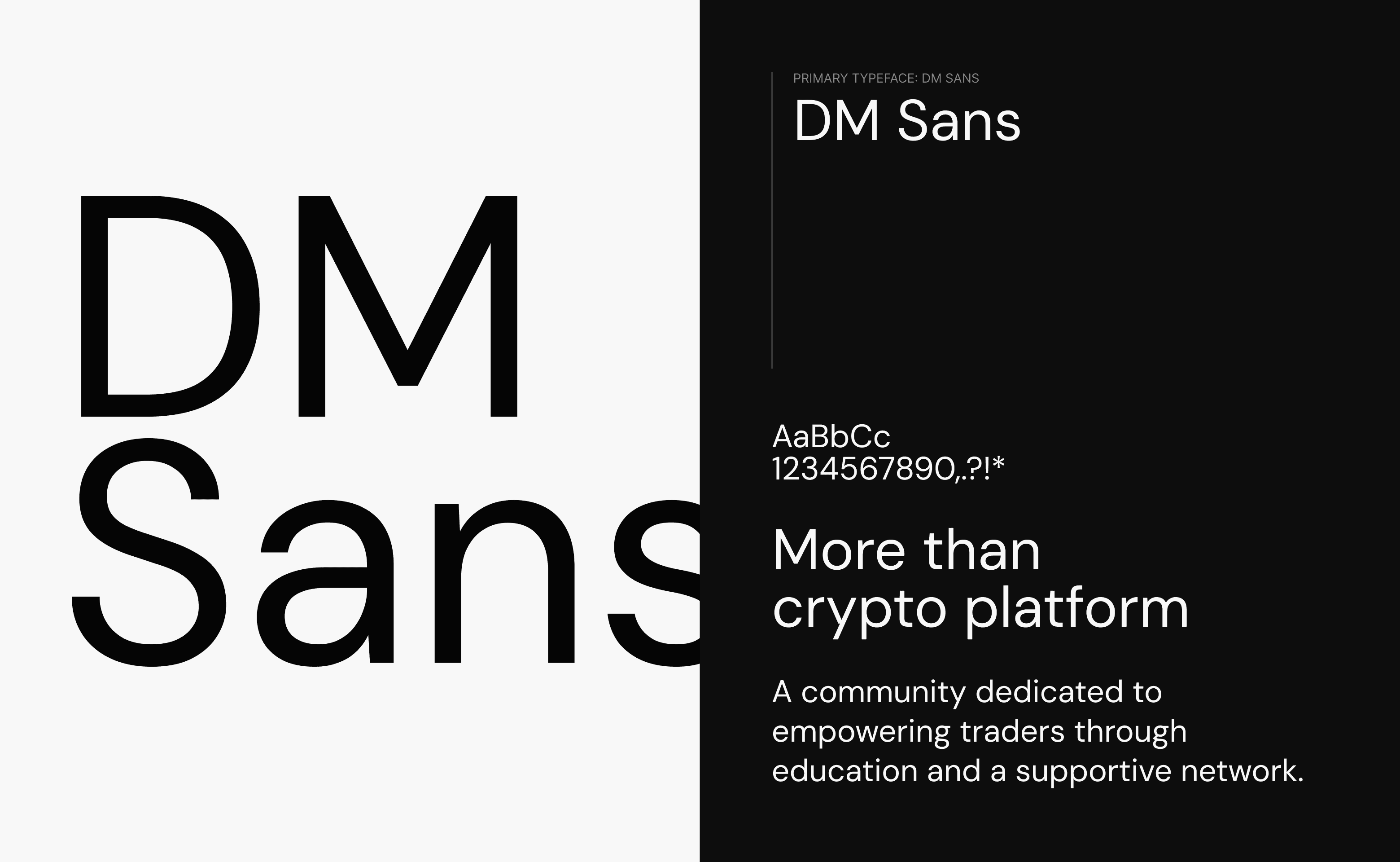
As Kaizen’s sole designer, I led the brand refresh, developing a cohesive visual identity, including a color palette, typography, and graphics.
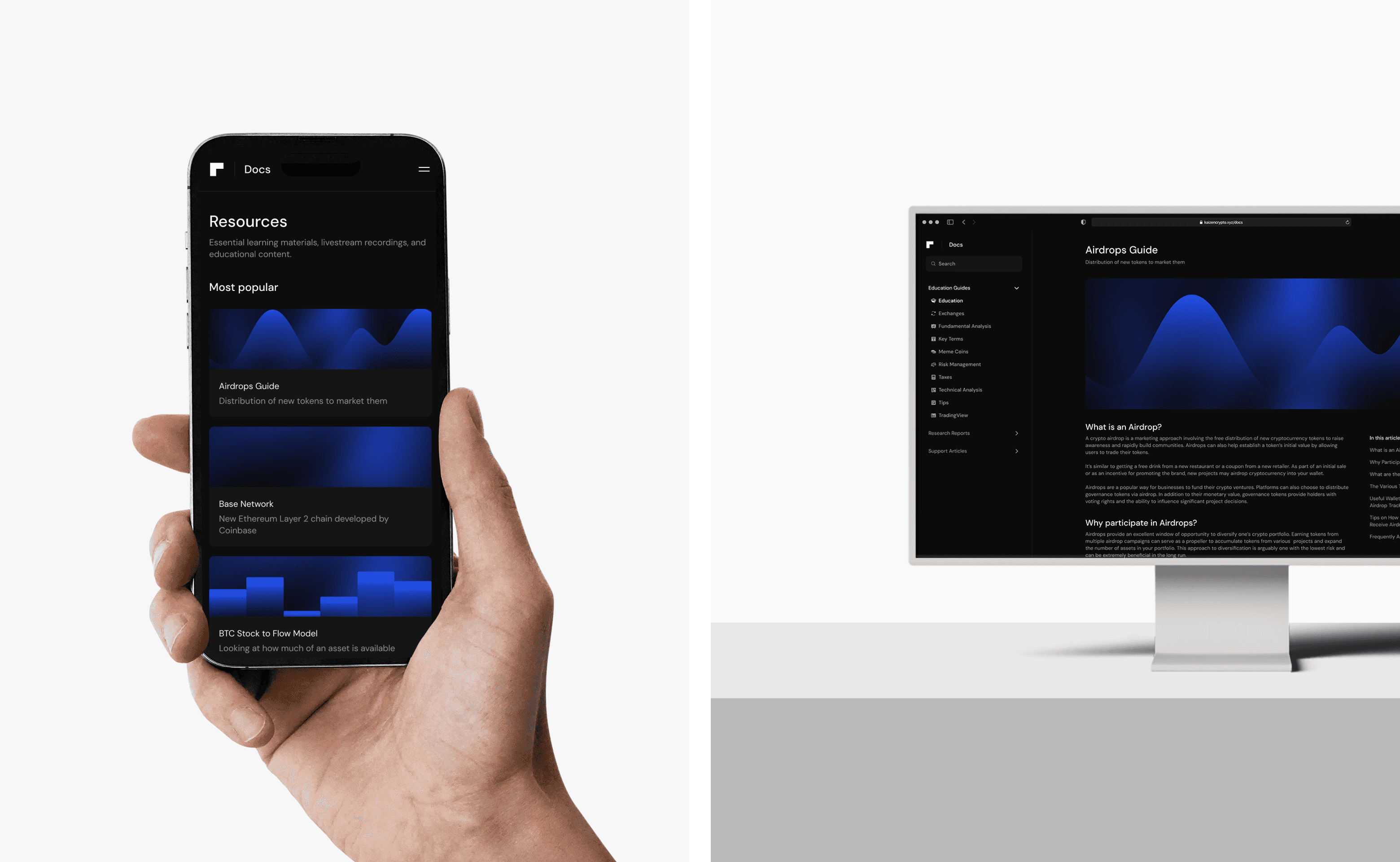
I designed social media assets and directed the creation of a document-hosting website to enhance member access to resources. My work aimed to streamline brand assets for consistency and amplify Kaizen’s messaging as a trusted, premium community, aligning with the goal of strengthening its position in the competitive crypto education space.

Approach
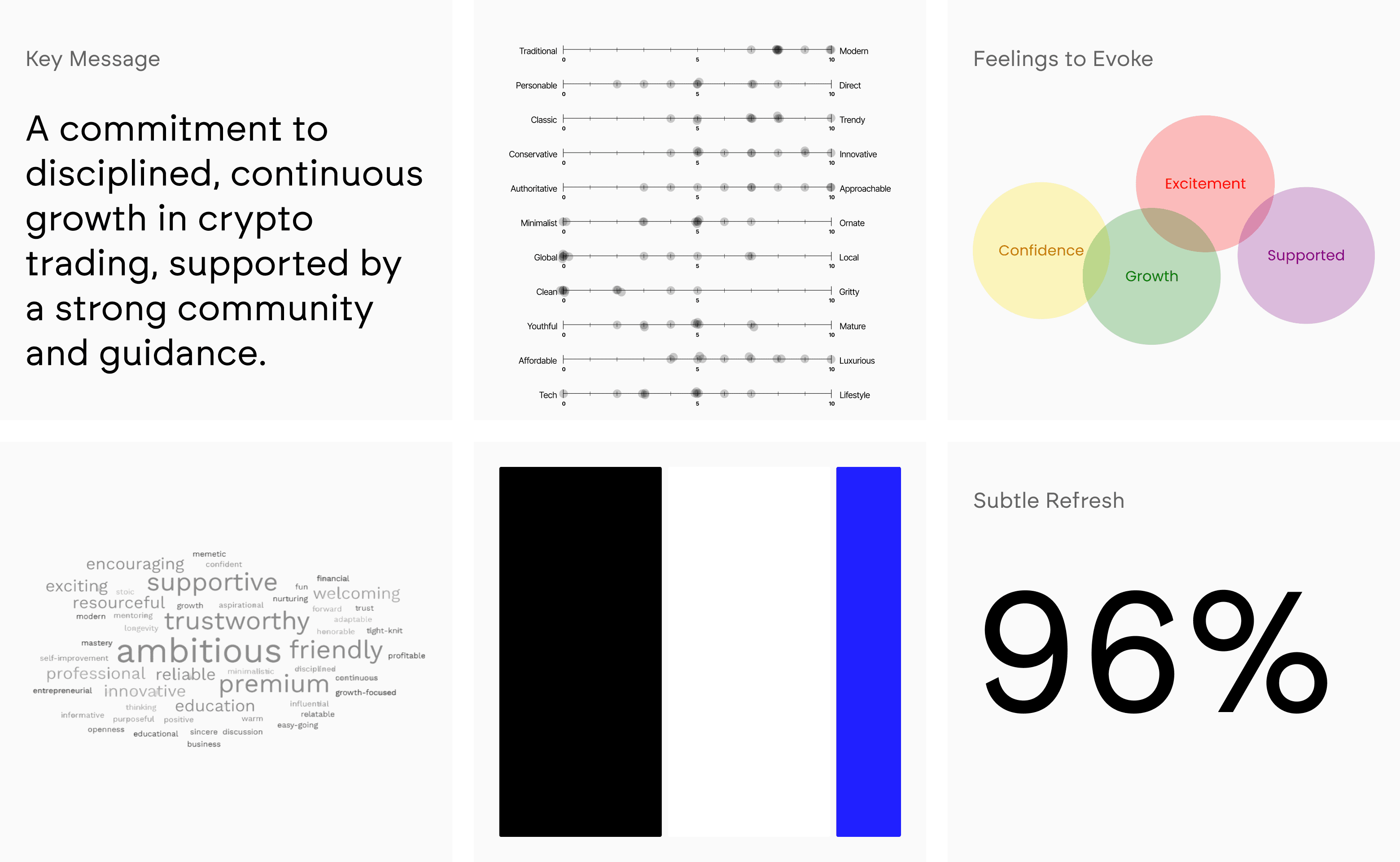
An internal brand survey was conducted to capture the perspectives of employees; key stakeholders who understood Kaizen’s culture, operations, and member/user needs and motivations.
The survey captured fundamental brand questions like 'What is Kaizen?' and explored perceived brand personality. I had employees rate Kaizen's current aesthetic on various scales and share their sentiment about the refresh initiative.

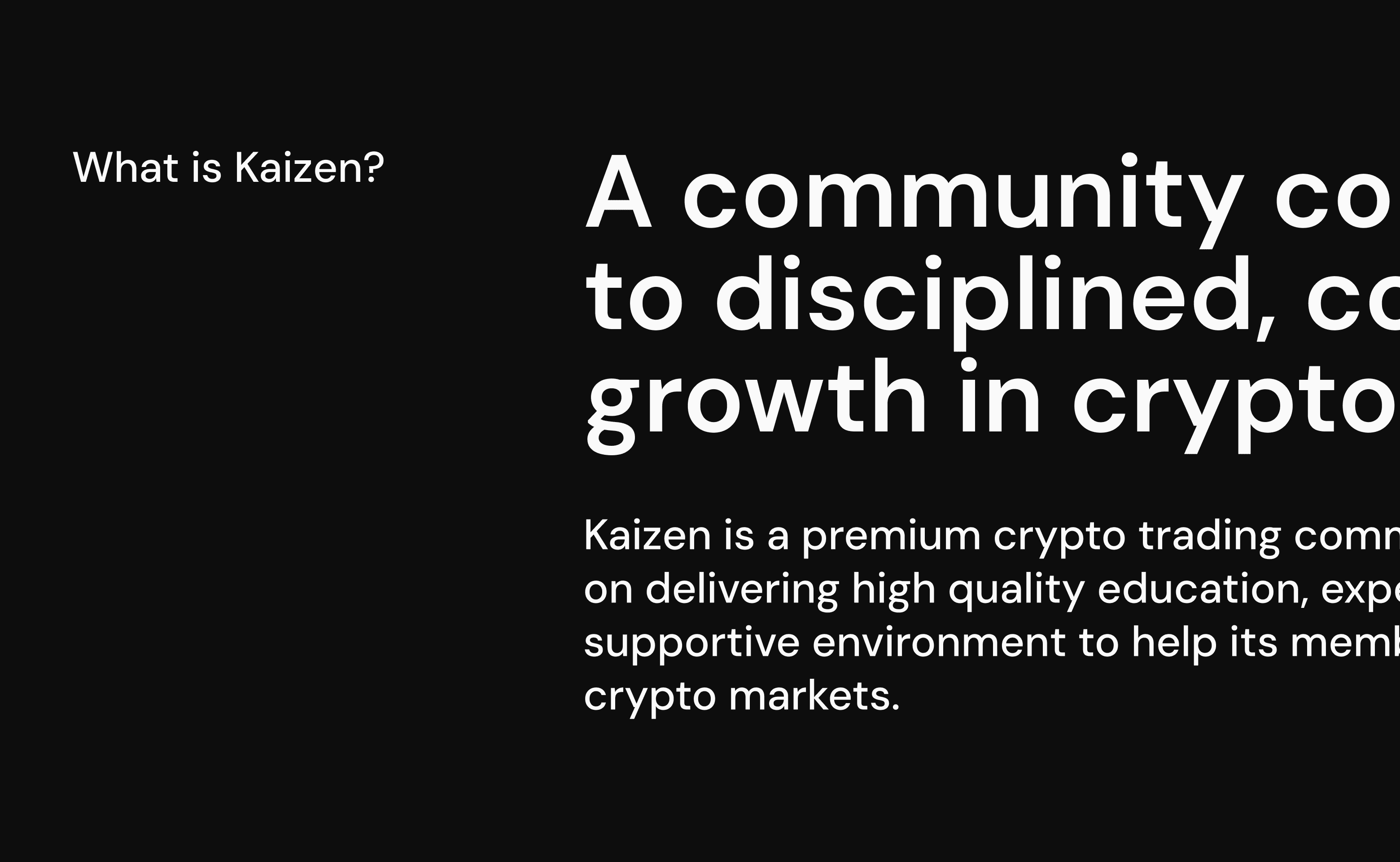
The core message that emerged from the survey results was about disciplined, continuous growth in crypto trading, supported by strong community and expert guidance.
Employees consistently rated Kaizen as modern, clean, and minimalist. The emotional goals were confidence, growth, excitement, and feeling supported. There was also a strong alignment on black, white, and blue as the primary palette.
Perhaps most importantly, 96% wanted a subtle refresh rather than a complete departure. This told me I needed to respect what was already working while solving the consistency issues.
These insights became my North Star throughout the design process.
Results and Impact
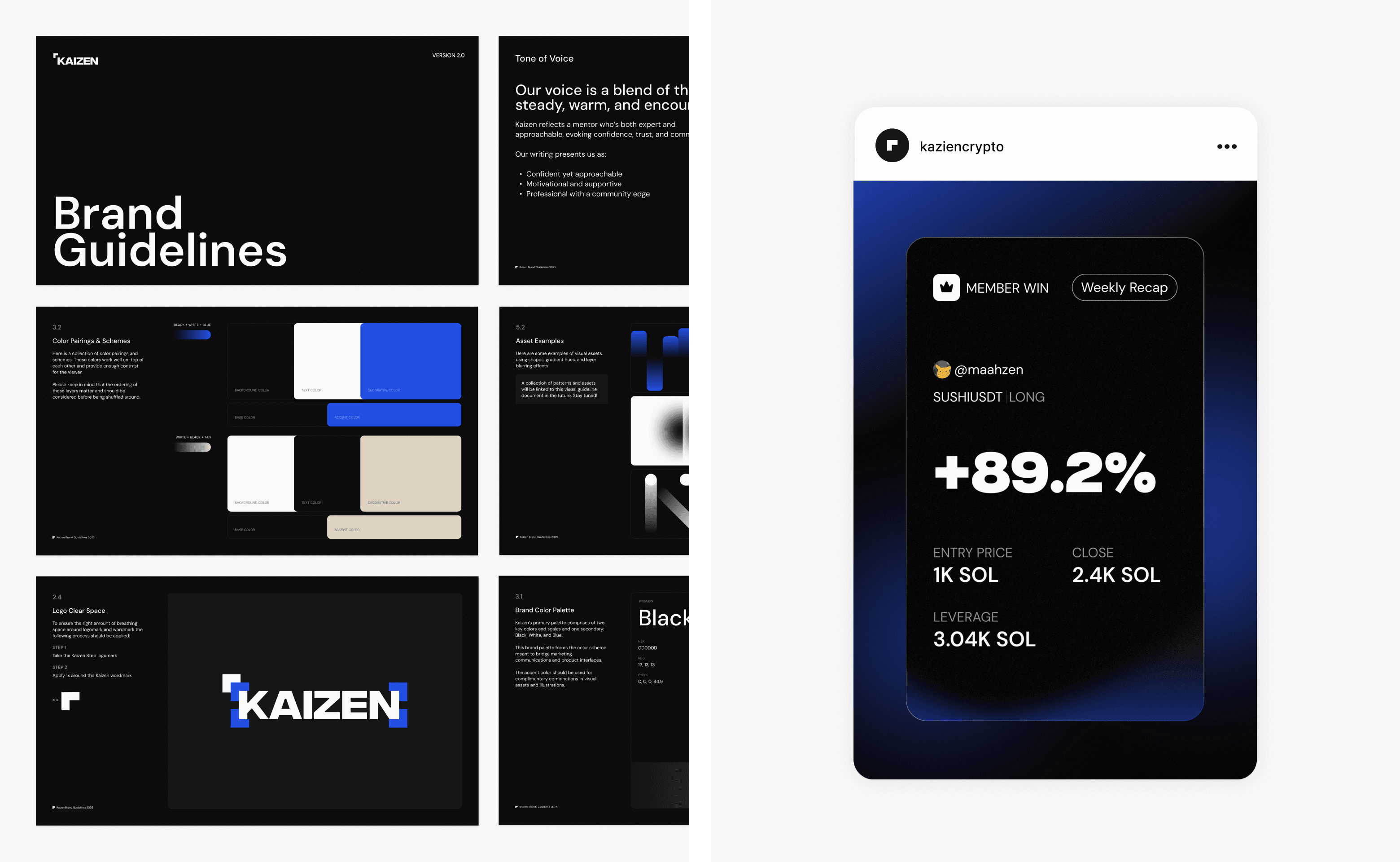
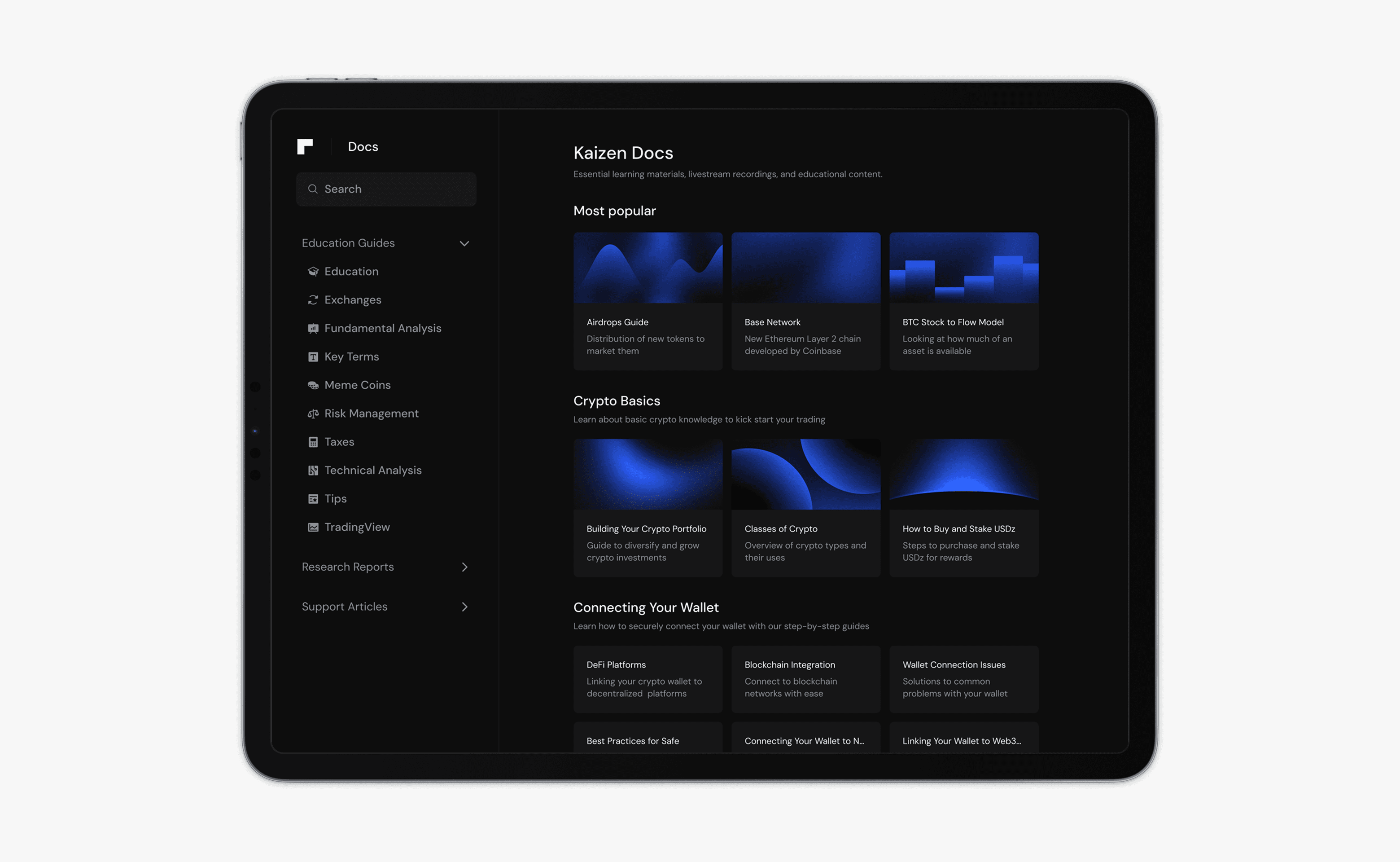
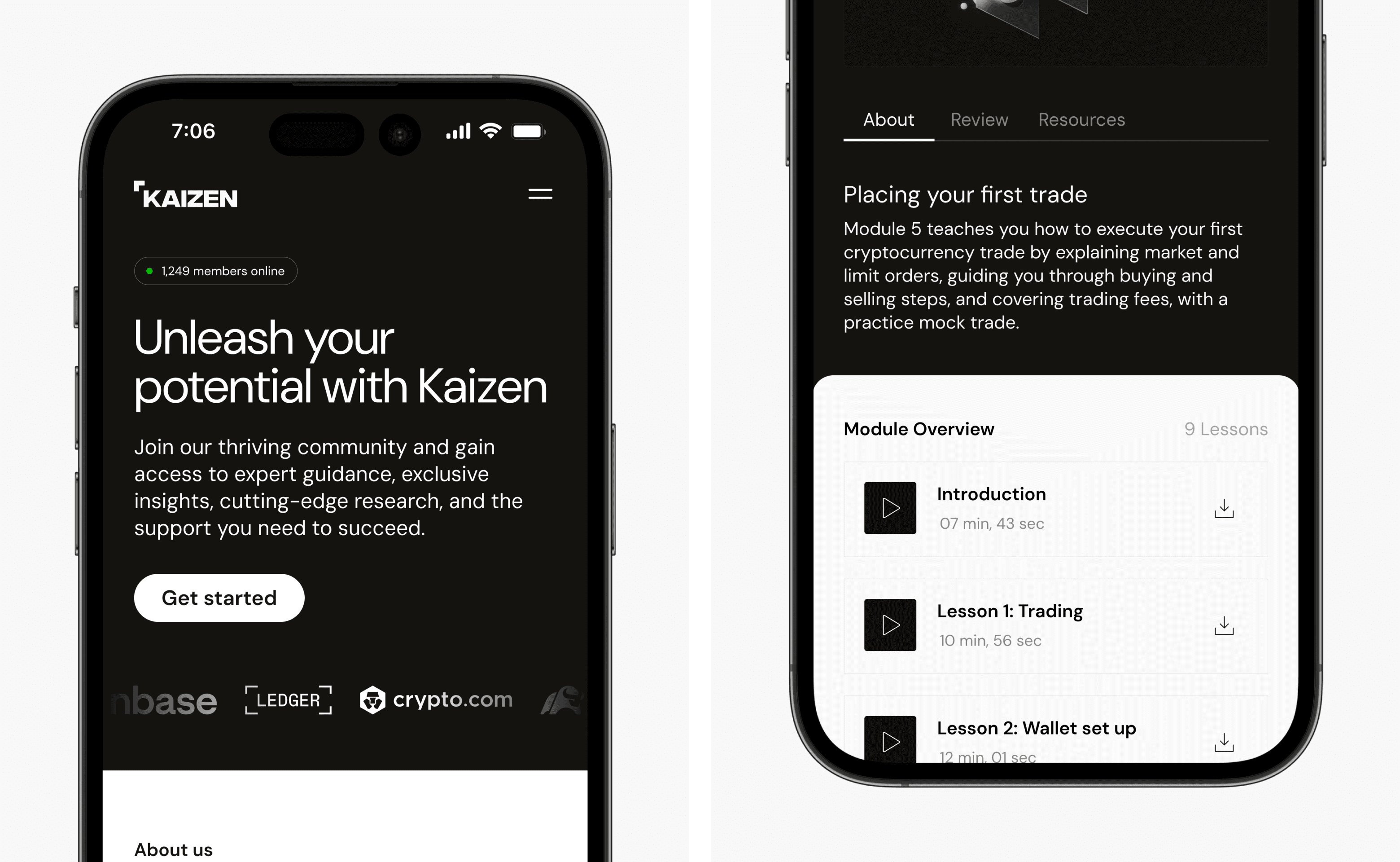
The refresh produced a Brand Visual Guideline document, social media templates, updated colors, and a website hosting educational content, improving member engagement and accessibility.
These deliverables established a consistent brand presence, reinforcing Kaizen’s leadership in crypto education. Qualitative feedback highlighted increased community trust, with proposed metrics including higher member retention and platform usage.
The cohesive identity continues to support Kaizen’s mission of delivering expert guidance and fostering sustainable trading success.
Leading the way on crypto education and complex documentation systems? Let's explore it together.
Grab a time to chat with
